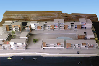
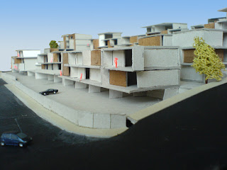
Here's something fresh! These were rendered yesterday, and posted today by Andy's request. This is a development of 36 housing units. They're rather rough renders. We focused on producing the drawings for each one so that we could apply for planning permission within our timeframe.
This is an overview. There are two roads which give access through the site to the houses, and for each road elevation there is some repetition in the buildings.
Here's a coser one, showing some materiality.
This is a bit more refined, and a great view in my opinion. Its at the end of one of the road, and theres a closer proximity of the houses. On the right is a quick attempt at a horizon using a spherical backdrop and a procedural sky.
Don't have time to write about the strategy or the design on this one. Maybe in a few months, with a few drawings.
blogfolio
4 May 2007
8 Mar 2007
Universal housing
This proposal was prepared for a developer from London, for a site in Kato Paphos. It comprises of about 70 housing units, arranged around large outdoor areas.
The site is at the base of a rock cliff, with the opposite side facing west to the sea. The units are facing west, as well as focusing toward the center of the site. There, they surround the outdoor communal areas. After the strategy was developed, we started a working model. The strategy was tweaked considerably over the first few weeks.
Finally, there are 4 outdoor areas. On the image below, from left to right: the garden, the sqare, the park, and the swimming pool. The idea is that they correspond to traditional socializing places of the island: a private house yard/garden, a village/town square, a wooded area/forest, and the beach.
The orange shows an elevated promenade. It overlooks all the central communal areas and runs accross the whole site.
Finishing the model, we went into a bot more detail, designed the elevations of the buildings, and added more variety to the materiality of the scheme. Communal facilities, shops and a restaurant are placed near the square.
Vassili residence
Here's a project from a few months ago, a house in Deftera village. It is situated on a cliff, one that forms a rather shap corner. The plot was right on that corner, something that we used to generate the form of the building. On plan, we followed the contour lines, to create the main enclosure of the private spaces, the territory of the house.
This is a good example of a concept that is derived from the context, in this case the physical context, the topography of the site. The proposed building has a V-shape, as a result of this. The fact that is the initial of the client (Vassilis) is completely coincidential.
One leg of the V (western) houses the three bedrooms, with bathrooms. The other leg (eastern) contains the living spaces: dining room, kitchen, seating areas, lounge. The building is broken up by voids. All of these look down into the basement, and are pieces of a garden, with trees growing up through the house. Inside the V is a sheltered outdoor area, with an overflowing swimming pool.
5 Mar 2007
Faros Beach Pavilion
The pavilion was designed as a stand-alone structure, that can be quickly assembled on a beach, and provide all facilities suitable for bathers, in a simple and compact package. The structure accommodates changing rooms, showers and toilets, as well as a vending area and a basic kitchen for drinks and snack preparation. It provides a covered deck, intended as a seating area.
The whole structure sits on pile foundaions, so the pavilion is raised from the sand. Instead of fully engaging with the site, it hovers above it. A steel frame is built up from the foundations, and the interior is enclosed with sandwich metal panels. The seating deck is shaded with aluminium louvres.
The mayor of Paphos requested the design for a pavilion at the Faros (lighthouse) beach. The project ended up being a stand-alone piece that could just as easily be set up on any beach, or other outdoor area, to provide these basic facilities. This has already been considered by people in the municipality. The success of the first one wil determine whether we will see more of these.
22 Feb 2007
Medblue Offices
Description
This is a two-story office building in kato-paphos, on the way to Faros beach. The entire ground floor is an open-plan office space. As such, configuration of the space from there on is entirely up to the users. There is a balcony-like loft, accessible via an open staircase, set at an oblique angle.
The top floor houses two units, which are configured to be used either as appartments with two bedrooms, or offices. In form, each of the two units is a seperate volume sitting on the roof, and clad in a different material.
The process:
The concept was developed mostly by Andreas Vardas, but with my valuable input. He became stuck while making a comcept model, as he couldn't find a form that quite worked. I suggested breaking up the volume of the top floor to lighten it, and achieve a certain visual effect. My suggestion was met with some skepticism, and in the end I had to snatch the (foam) model from his fingers and cut it in half, rearranging them on the composition.
10 Jan 2007
Paphos old harbour
Another all-nighter tomorrow? Possibly.
My current project has to do with replacing the shading structures erected in front of shops and cafes at the promenade in the old paphos harbour. Its now almost exclusively a commercial and recreational area, the only boats there being small fishing boats, the coast guard, a few tourist boats and yaughts and other recreational vessels. The cliend is the municipality of Paphos.
The current structures are obtrusive, dark, and completely cover up the facades of the stone buildings behind them, which the municipality wants freed up. The shop-owners have used shading devices of their own to expand the territory of their business further on the promenade, adding depth to the structures, and worsening the problem. As a result, even I have no idea or recollection of what the actual buildings there look like.
Our proposal is for modular structures, which will be light, transparent, and set back from the buildings. They should provide just enough shade for the summer, but not too much as to darken
everything underneath. We're trying to make them high enough to allow the sun through during
the winter, when it is lower. The shop and cafe zone is narrowed, compared to before, but another
narrow zone is provided on the opposite side of the promenade, by the sea. This has the pedestrian
road run between them.
The modularity of the structures should reduce cost and the time required for assembly, as well as make maintenance and cleaning easier. Round columns every 5 metres will support a metal grid frame. Another aluminium frame containing timber louvres will be slotted in the first. Polycarbonate panels will be fitted above the louvres, providing shelter from rain as well. The PCP panels are self-cleaning, and the louvres are removable for easy maintenance. It will be designed so that only one row of columns is required, to free up space
underneath.
9 Jan 2007
Wii thoughts
I got my Nintendo Wii this Xmas. Just before Xmas to be precise. A week after its launch.
My initial idea was to write something on the social impact the machine has made in my home.
But that'd be boring. Instead, I will simply list my thoughts on the experience, good or bad.
- The appearance of the console and controllers seems to borrow from the initial i-pod designs. A lot! White plastic covered in clear polycarbonate. Very sleek. Also, clean and discrete. It takes up very little space, too.
- You'll need a lot more space in the living room, around the TV, in order to play. Especially multiplayer, as in Wii sports tennis doubles.
- Other than sports, most other games can be comfortably played sitting down.
- I'd like to see the LED light up more often!!!
- How come no-one thought of the pointer before? Still, it makes sense that such a fresh idea was introduced by Nintendo first. On the downside, pointer movemend becomes erratic when you play from a distance. But thats not an issue in my (admittedly spatious) living room)
- Depending on the implementation, motion sensing controls are either fantastic, of plain broken. Tennis, bowling, batting, golf detect motion almost flawlessly. Boxing and pitching in baseball are crap. When it does work, the level of immersion is remarcable, as close to the real thing as possible. Therefore...
- ...as far as I'm concerned, the controller is a success! Now its up to the softare designers and developers.
- Mii channel isn't particularly fun on its own, but seing recognisable faces in games is fantastic!
- It makes me wish my camera used SD cards, then maybe i'd use the photo channel every once in a while. When i did test it, it ran smoothly, loading photographs on the fly and without delays.
- If only I could use my wiimote and nunchuck to play gamecube games...*sigh*
- I want to be able to use my keyboard, flash memory, card readers and external hard drives on the USB ports!!! And for the photo channel and messageboard to support them!
- I want a music channel exclusively for playing mp3s...how easy would it be to implement?
- My parents often join in for a competitive session of Wii Sports!
- My sister got paranoid about beating me in tennis...
- ...and so did my mum.
- I came home one day to find my dad playing 4-player bowling...by himself!
- I can't wait to connect it to the internet with Wi-fi. I want to have my Miis mingling, to watch a Mii parade and send messages to friends over the messageboard.
- The internet channel! I'm curious how it will display at these low resolutions. I'll be playing flash games, accessing my e-mail, watching videos on Google video and youtube.
- It will let me stream all kinds of content from my PC hard disk, over the internet, using Orb! Photographs, music, video. Yes, it does become a big deal when you can view your digital photos on the 42" plasma screen in the living room. With friends.
Subscribe to:
Posts (Atom)